Bug Reports: Airtime 2.1.0 Beta 5
-
Tested using the same browsers I used for beta 4.
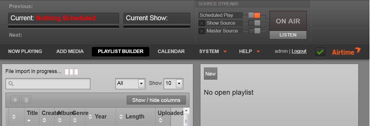
1) Running on a monitor set to 1024 x 768, the Playlist Builder column titles overwrite each other because they extend past the column right border. The title text, when this happens, appears above the sorting graphic. See the attached screenshot for more information (003.jpg).
2. Dragging and dropping single selections into a show creates
multiple entries after the first item and none of the items are added to
the show (Show Contents is empty).
3. New content cannot be added to a show that has already started.
4. Shows that span across a day (e.g. from 23:45 to 00:45 the next
day) have two different titles. The show on the 2nd day becomes
"Untitled Show" and clicking it behaves differently than the show on the
first day. For example, after the show started at 11:45 I was unable to
add more content to it, but clicking on the "Untitled Show" - which is
part of the same show - allows me to try to add content.
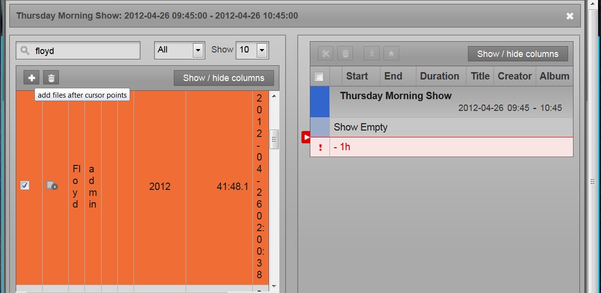
5. Clicking on the '+' to add a playlist to a show does not work - see attached image 004.jpg. The tooltip text (over the '+') is confusing because it talks about a "cursor points". Does this refer to the red arrow on the right? I noticed that clicking the arrow turns it from red to black but did not see anything else that changed.
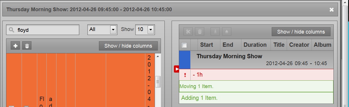
6. Dragging the red arrow after adding a playlist to a show causes a new item to be added 'Moving 1 item', but nothing shows up in the calendar under "Show Content" - see attached image 005.jpg.
Post edited by Wade Eilrich at 2012-04-26 12:43:34 -
2 Comments sorted by
-
Thanks for the tip. This is actually something we noticed and weren't sure what to do about. Any suggestions? At the moment we're assuming the user will simply reduce their number of columns.Airtime Pro Hosting: http://airtime.pro
-
I think you could fit the initial column size to the title text. You already allow horizontal scrolling and that will handle wider columns gracefully. I think it would be a good idea to allow the user to drag the right border of a column to resize it (optionally, double-clicking the border would make a best fit). In this case, because the user could deliberately make the columns too small for the title text, I would truncate the text. Perhaps add a capability so that when the user hovers the mouse over truncated text they get a tooltip that shows the expanded information. This could work for the text in the column body as well. It looks so strange to see three or four letters of a title (for instance) on eight or nine lines. The title, creator, and length are the fields I use the most.


Howdy, Stranger!
It looks like you're new here. If you want to get involved, click one of these buttons!
Categories
- All Discussions8,397
- Sourcefabric
- ↳ Announcements25
- Newscoop
- ↳ Newscoop Support2,189
- ↳ Newscoop Development722
- ↳ Newscoop Security13
- ↳ Newscoop Documentation17
- ↳ Newscoop Themes69
- Airtime
- ↳ Airtime Support3,139
- ↳ Airtime Development1,286
- ↳ Airtime Français146
- ↳ Airtime Documentation14
- ↳ Airtime Hacks102
- ↳ Promote your station!37
- ↳ Airtime Security11
- Booktype
- ↳ Booktype Support277
- ↳ Booktype Development55
- ↳ Booktype Documentation7
- Superdesk
- ↳ Superdesk Development264
- ↳ Web Publisher21
Poll
No poll attached to this discussion.Top Posters
-
 Albert FR
1978
Albert FR
1978
-
 Martin Konecny
1860
Martin Konecny
1860
-
 Andrey Podshivalov
1526
Andrey Podshivalov
1526
-
 Voisses Tech
1423
Voisses Tech
1423
-
John Chewter
899
-
Daniel James
844
-
Roger Wilco
784
-
hoerich
627
-
Paul Baranowski
389
-
Cliff Wang
339